Project Overview
I was asked to create a brand identity for the company. The deliverable included a brand new logo design, website UI design, and a pitch deck.
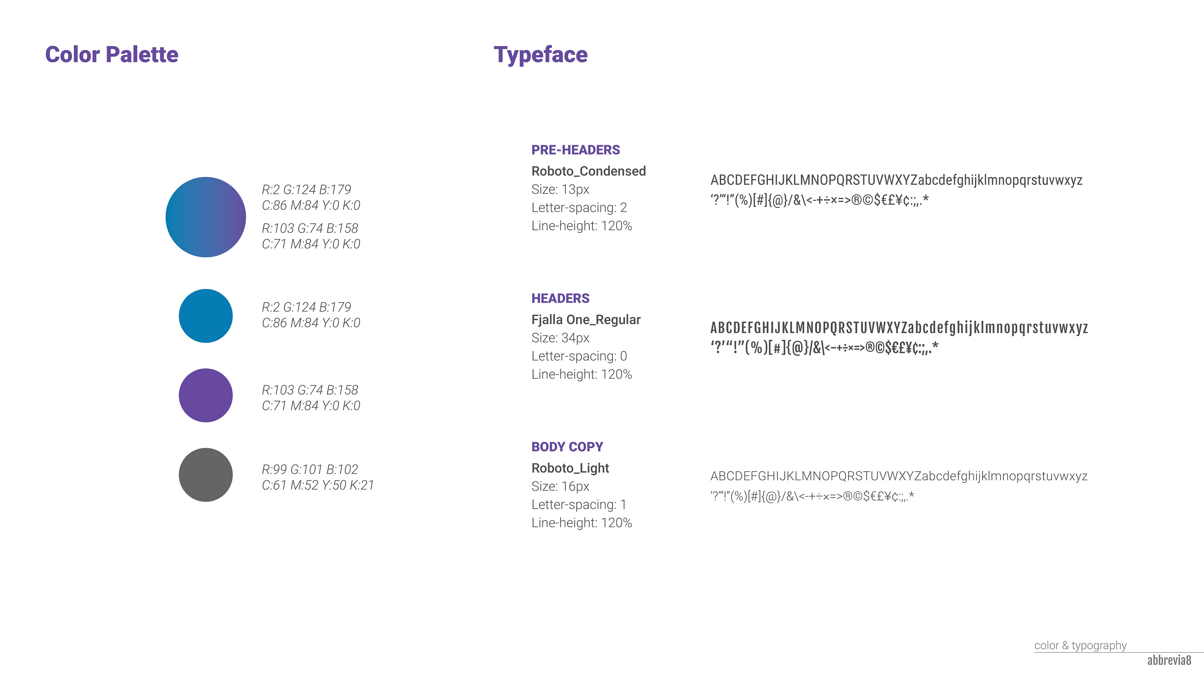
I started the project with the logo design and creating styles to the overall brand then moved on to the website design and the pitch deck.
I started the project with the logo design and creating styles to the overall brand then moved on to the website design and the pitch deck.
About Abbrevia8
Abbrevia8 is startup company based in Washington DC which is focusing in data analytics in support of government and commercial clients to provide intelligent discovery against a range of complex big data legal challenges.
The company's analysts identifies correlations, patterns, and trends.
Delivers actionable intelligence in a highly engaging format through the use of-intuitive graphics and comprehensive reports.
The company's analysts identifies correlations, patterns, and trends.
Delivers actionable intelligence in a highly engaging format through the use of-intuitive graphics and comprehensive reports.
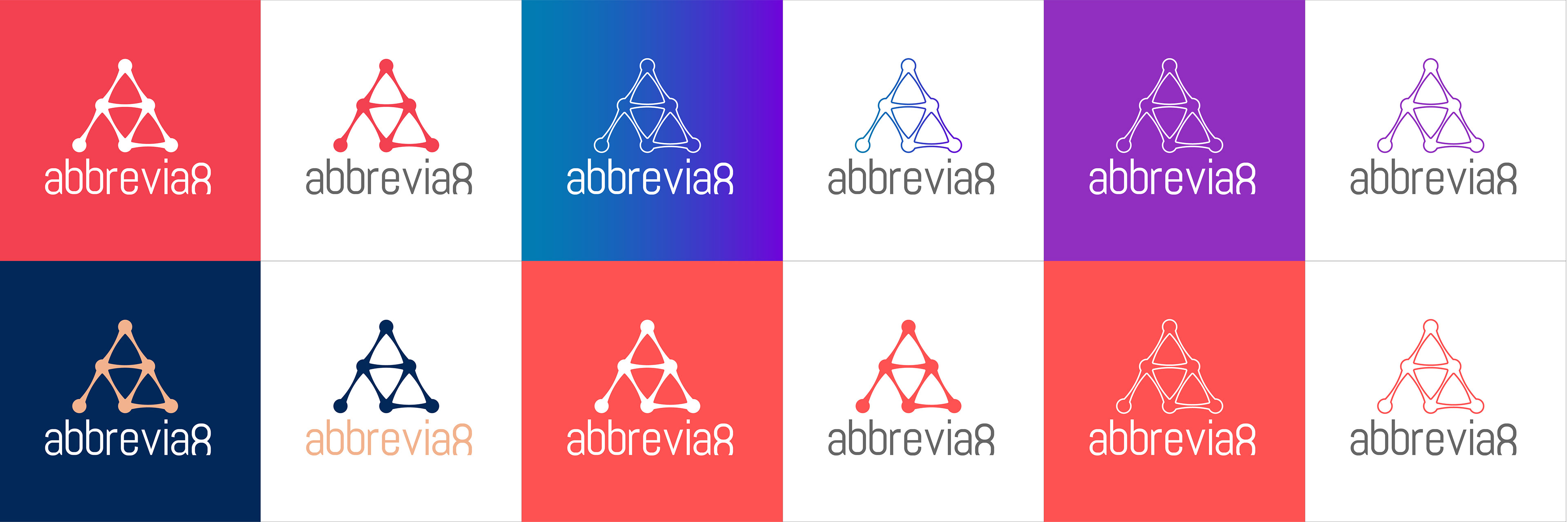
design concept
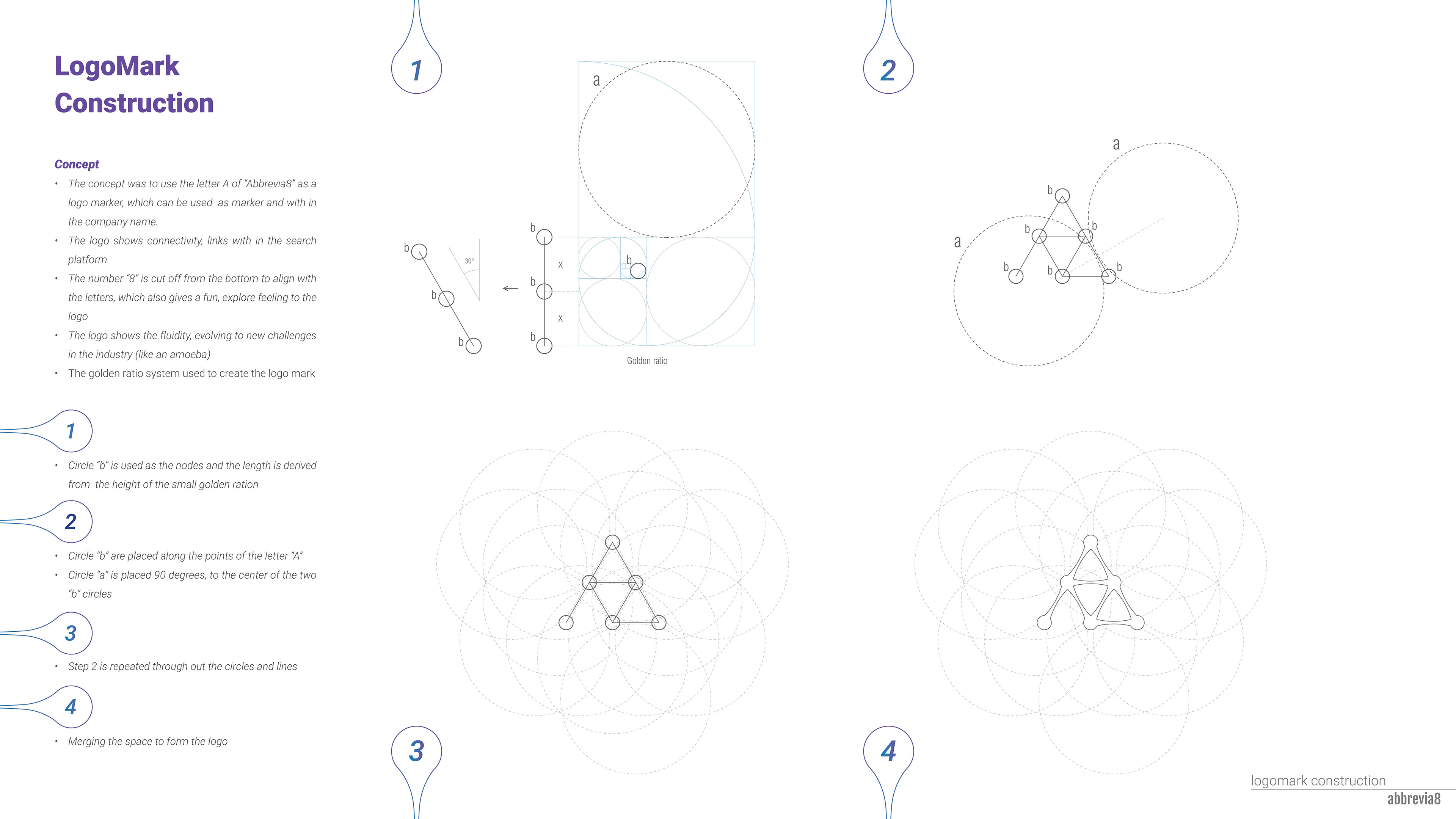
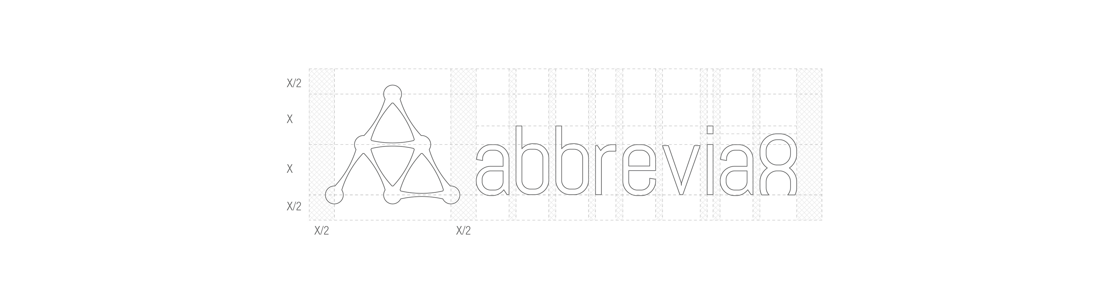
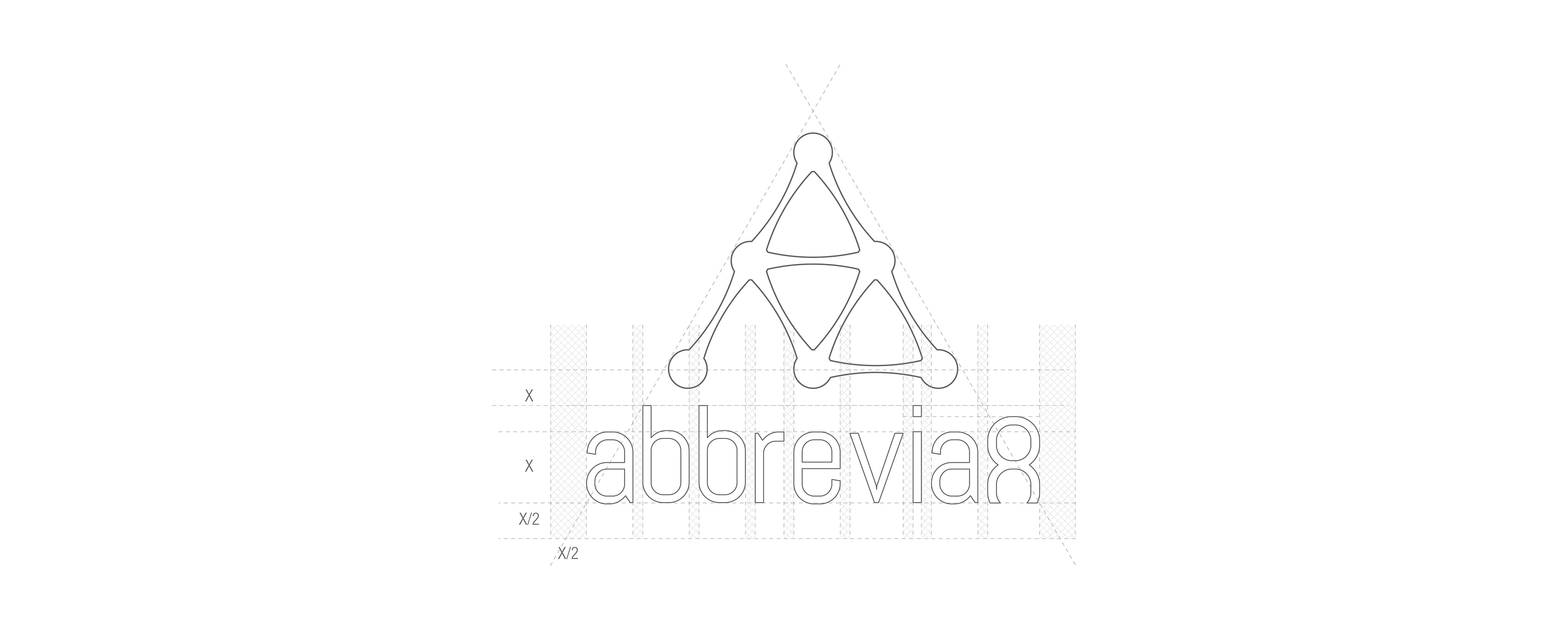
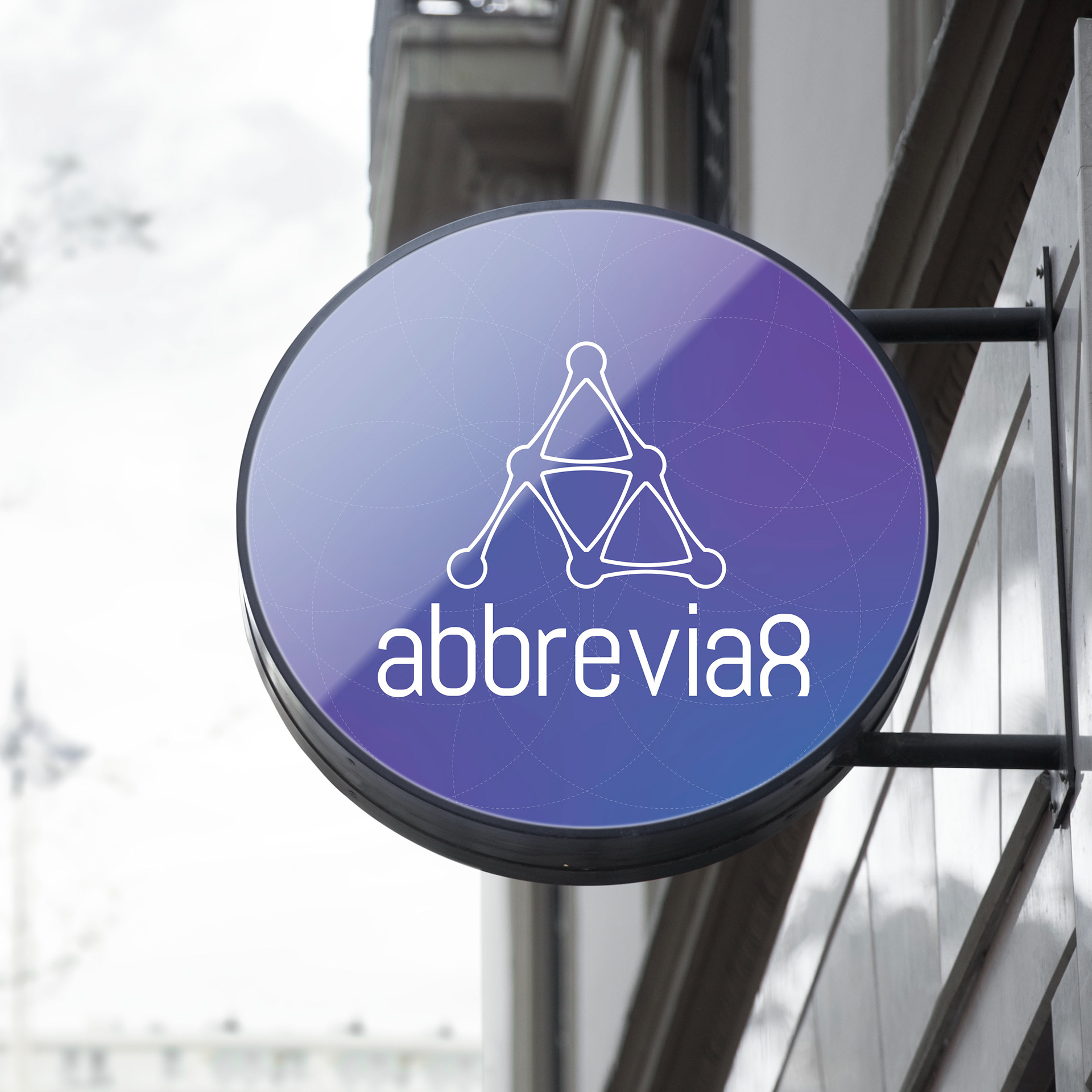
In designing the logo, I have followed these 3 rules.
1. Appropriate: the logo shows the connectivity through nodes and lines
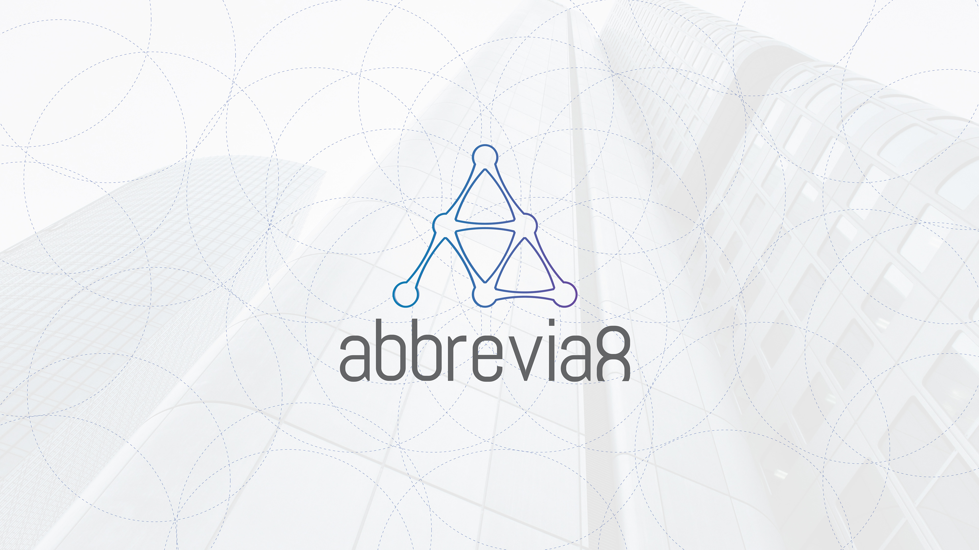
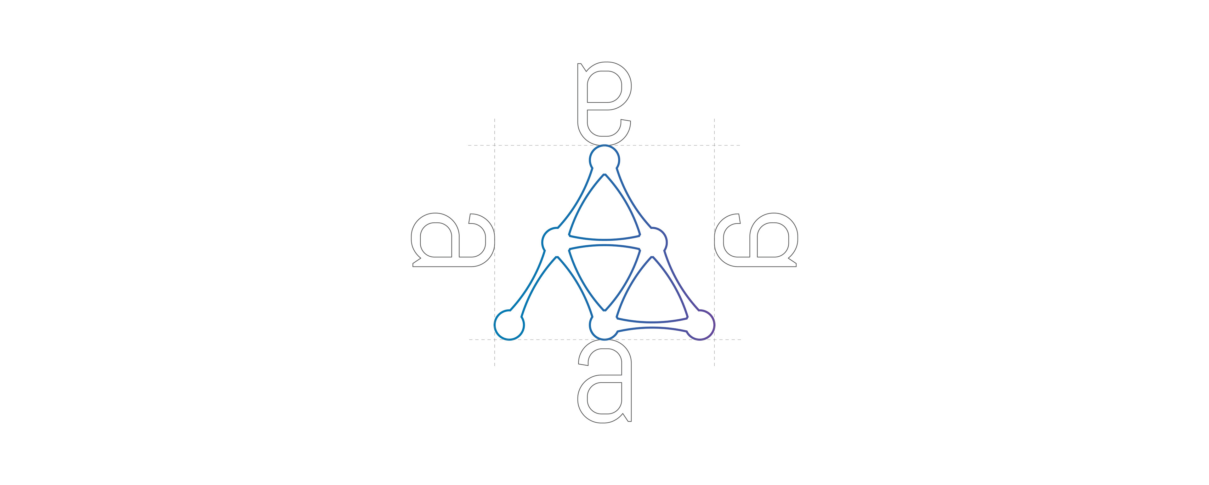
2. Distinctive & Memorable: to keep is distinctive, the logo represents the letter "A" of the company name, hence the reader visualize the connection to the company
3. Simple: the use of simple geometric shapes such as circles and lines keep it simple, easy to read and legible in all sizes
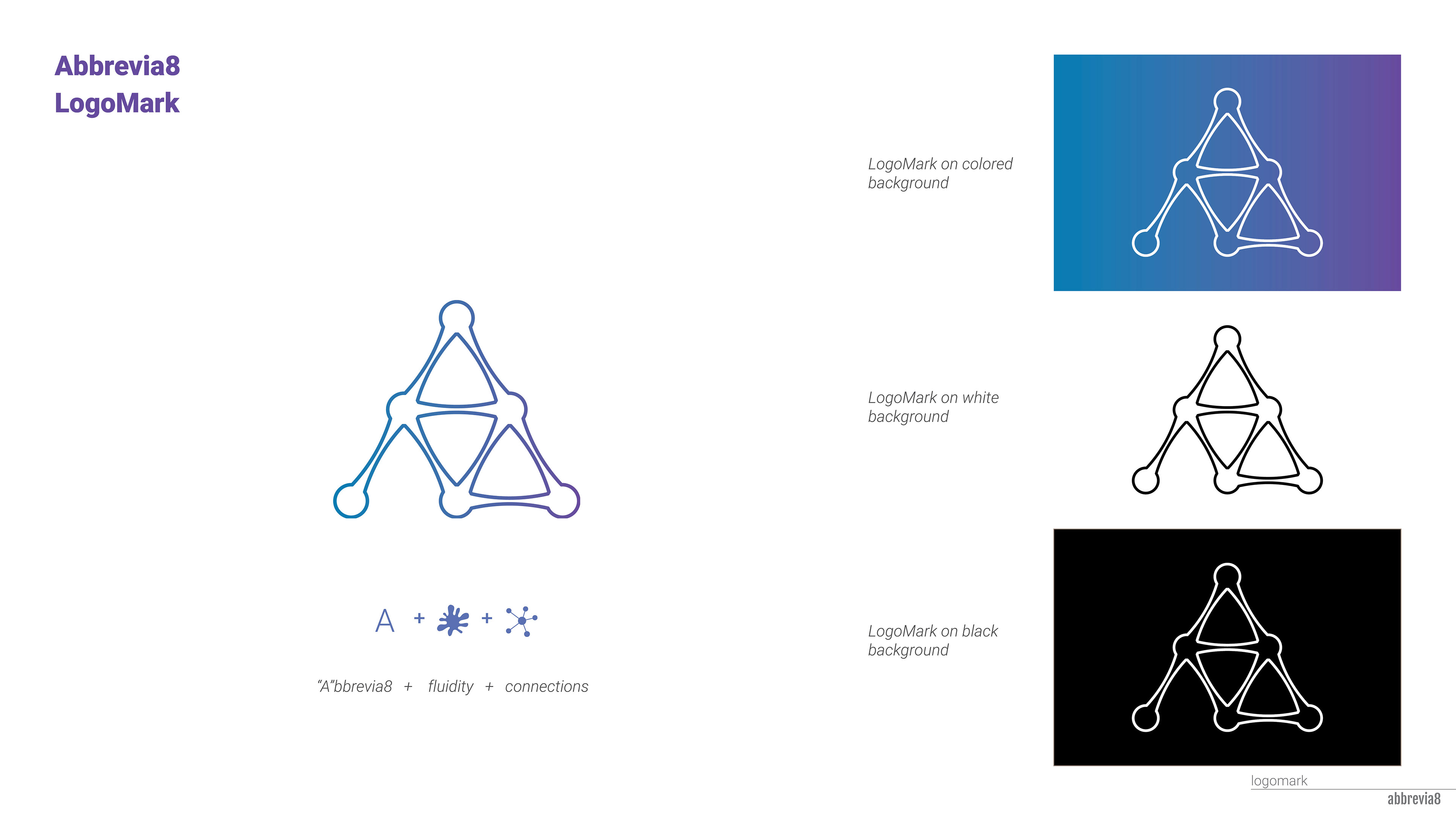
The concept was to use the letter A of “Abbrevia8” as a logo marker, which can be used as marker and with in the company name.
The logo shows connectivity, links with in the search platform
The number “8” is cut off from the bottom to align with the letters, which also gives a fun, explore feeling to the logo
The logo shows the fluidity, evolving to new challenges in the industry (like an amoeba)
The logo shows connectivity, links with in the search platform
The number “8” is cut off from the bottom to align with the letters, which also gives a fun, explore feeling to the logo
The logo shows the fluidity, evolving to new challenges in the industry (like an amoeba)


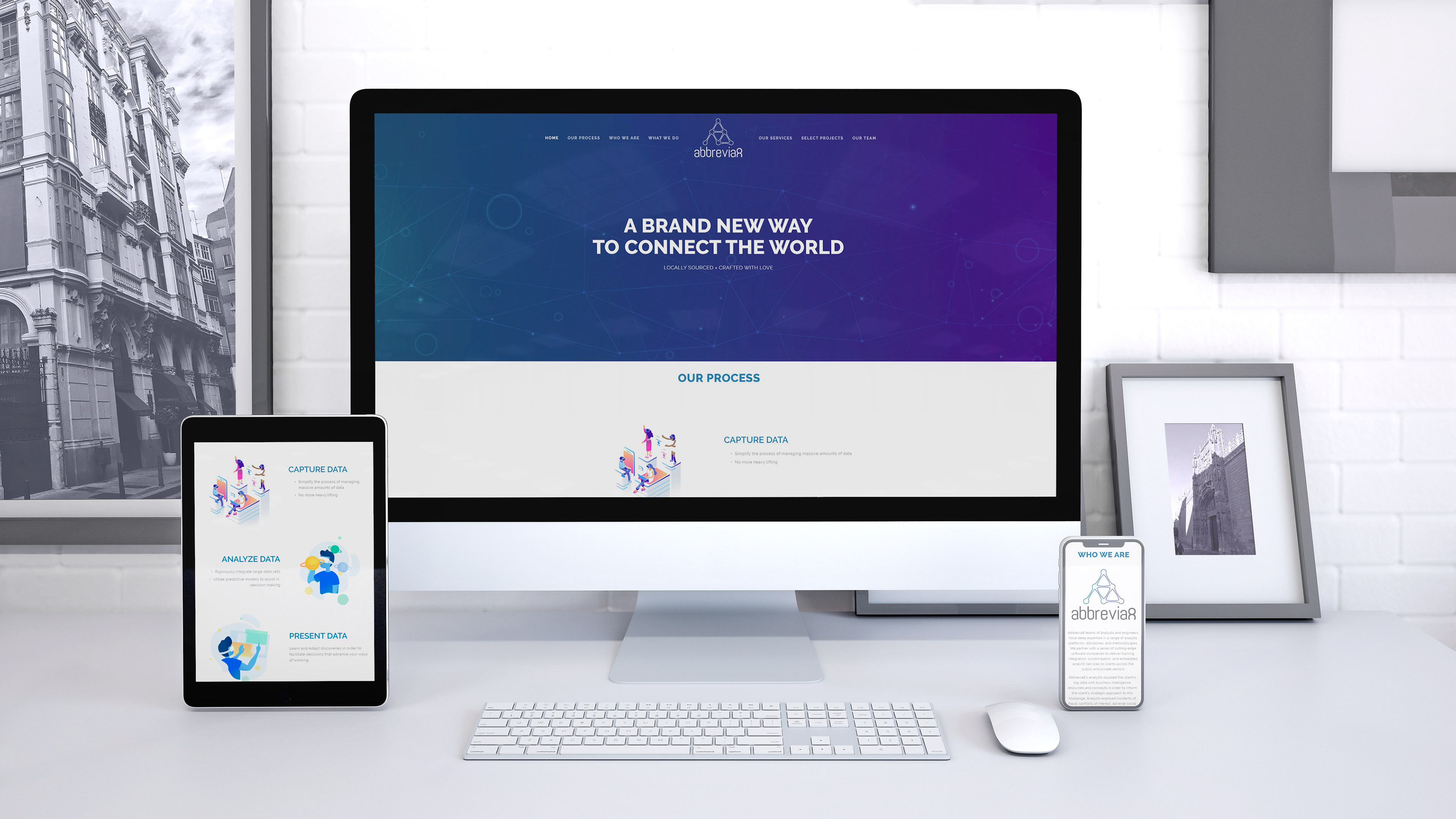
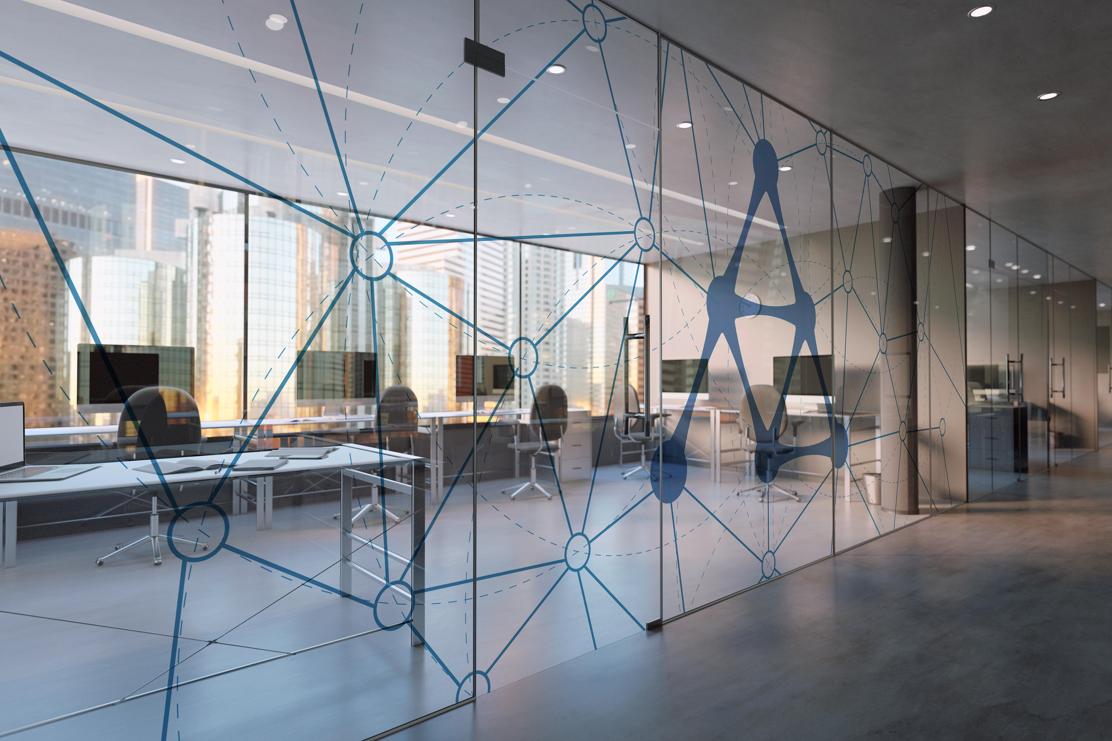
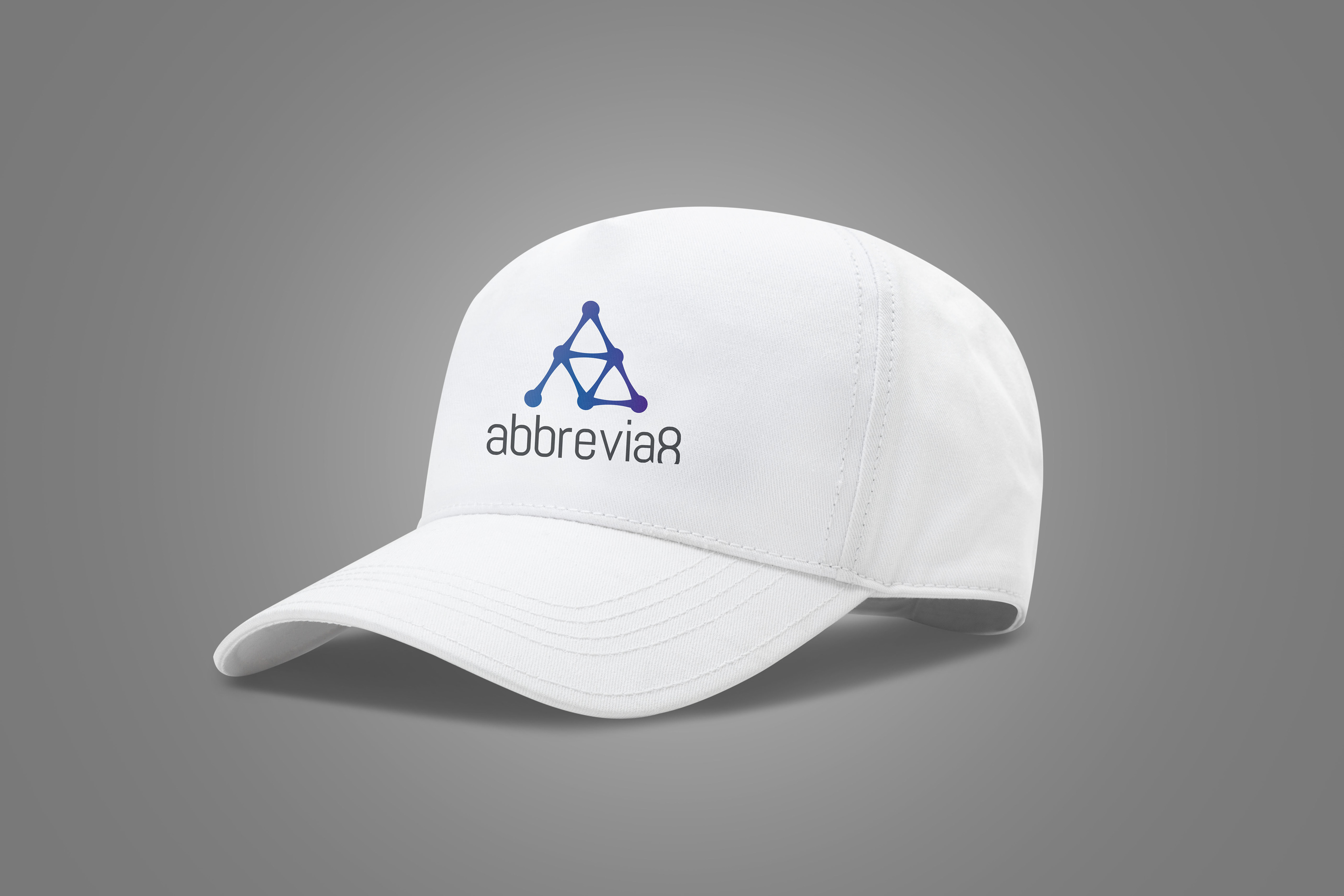
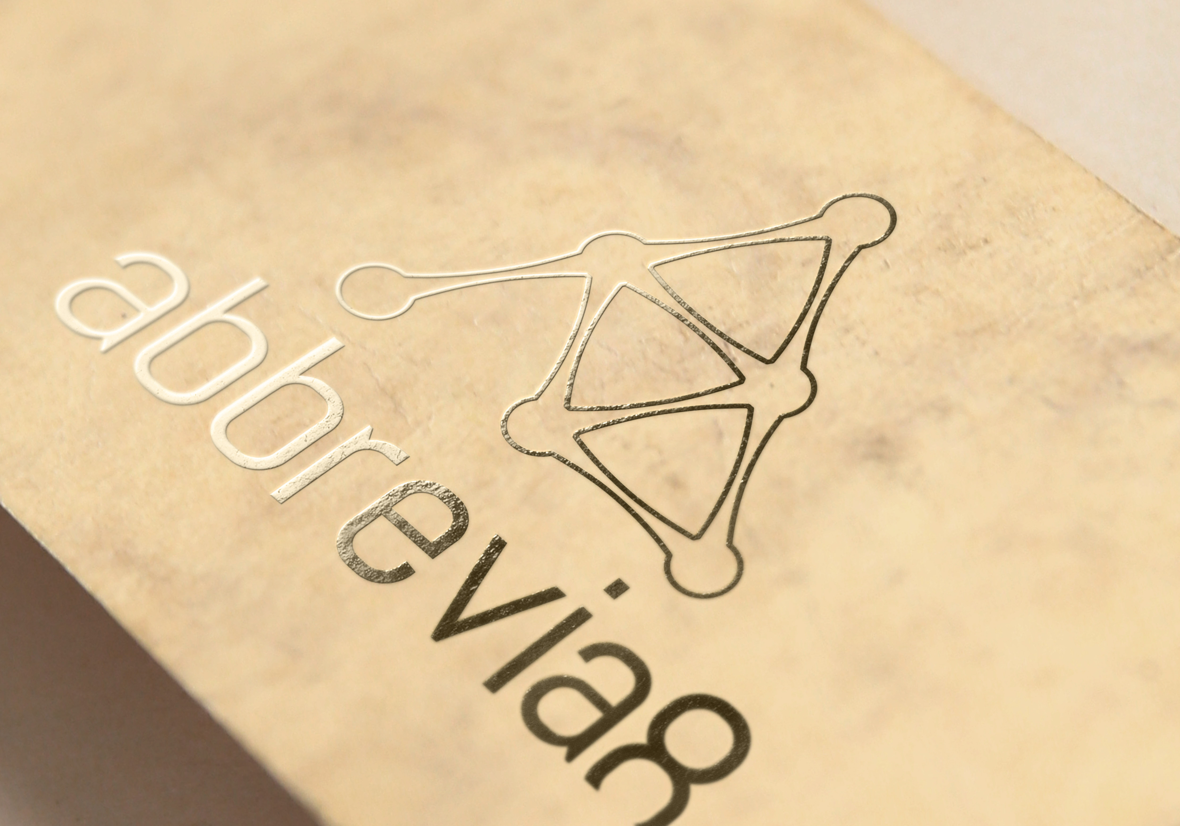
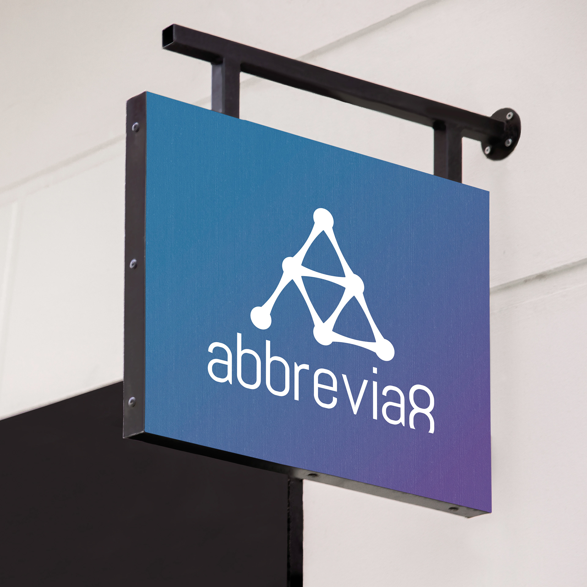
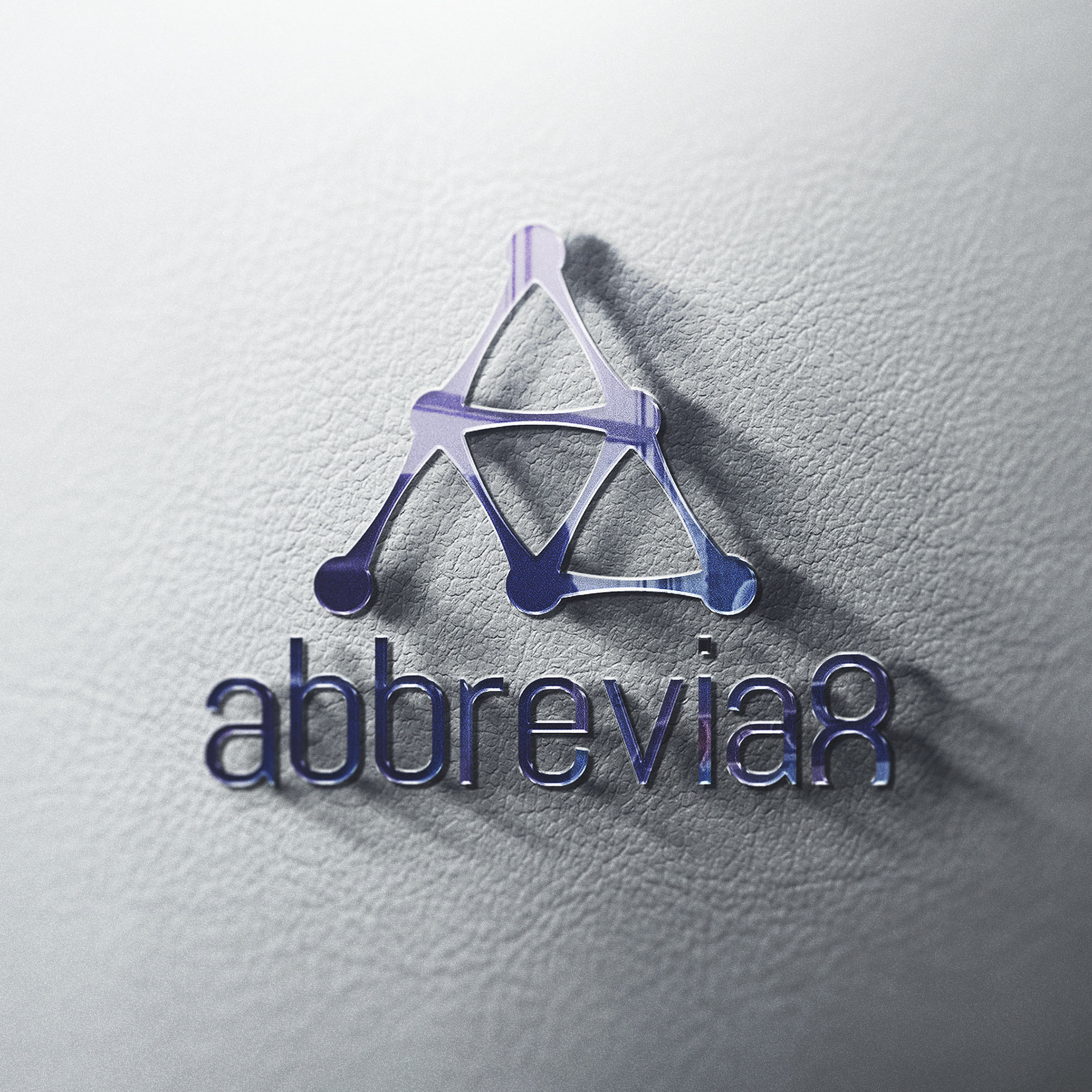
Mock-ups
Website UI Design